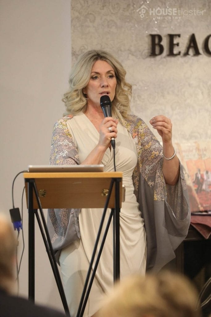
This year’s Color Trends 2019 event at DDB in New York City showed designers how this crisp, cool gray is influencing the design world.
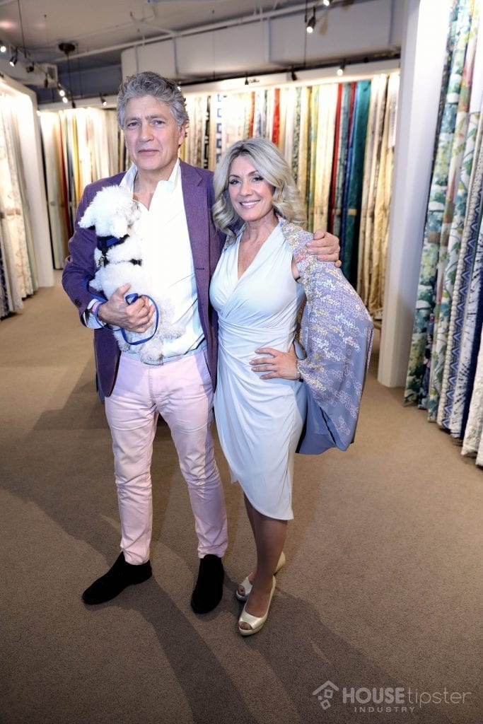
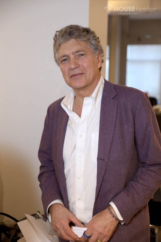
Benjamin Moore recently unveiled their pick for the Color of the Year 2019 as the striking gray neutral, Metropolitan (AF-690). To commemorate the announcement, Amy Figueroa of Benjamin Moore and interior designer Roger de Cabrol came together for a Color of the Year celebration at Robert Allen’s showroom in the Manhattan Decoration & Design Building on October 25. There, they discussed how this color stood out for the upcoming year, and what its potential applications can be across the design space.
If you follow the company’s trending color reveals, you know it is quite a transition to jump from 2018’s fiery red hue, Caliente (AF-290), to this year’s cool neutral shade.
“Did it puzzle you? Did it excite you? Did it concern you, or did it make you say, ‘What are they doing over there at Benjamin Moore?” Figueroa asked guests at her DDB presentation.
She explained that the company’s goal is to present a shade with a wide range of influence for the new year ahead.
“For us as a brand, we’re not trendsetters,” she said. There’s a difference between people who go into the world and have the special job of forecasting… and being the expert who says, ‘it’s as I see, and it’s as I say. [We’re] a company that helps complement what you do for business. We’re there to go out and do the research and bring back what we found. [We] come to you with a suggestion, and I emphasize suggestion, of what we saw the most in Italy, in England, in retail safaris, in fashion, in the automotive industry, in everything. And bring back a message to our clientele that’s relevant and can live in home interiors.”
The search for this color began in late 2017, and Benjamin Moore is observing a 2019-ready shift toward “quietude” and “retreat” that customers are longing for. Figueroa noted that in our fast-paced age, most of us are looking for a sense of peaceful escape from the bustle, which is why a powerfully subtle color like Metropolitan can deliver.
“Caliente, you could work that on the runway or a dress in Saks Fifth Avenue. But would it go all over the walls? Probably not,” she said. “It’s up to you to decide.
“Metropolitan is such a sophisticated thing that’s already going on,” she added. “How long has gray been a front-runner already for that neutral that marries the rest of a home together? We can use this Metropolitan color as an exclamation point in our designs, or use it as a backup singer that sets the tone.”
“The term ‘Soft Power’ became the theme for discussion of the Executive Color Team as they gravitated towards this color, and reflected in it during their travels. The things that stood out the most weren’t the ones as bright and strong in 2018, but rather soft and muted with elegance and a strong presence that’s not overt. It was a color found in designs everywhere across the globe, and it’s rooted in an array of natural materials.”
This is a color that works well with sheen, high gloss, and shine, and a matte finish will enhance the natural undertones, like green or blue tones in different lighting. It also has great applications in fabrics like Robert Allen’s, which designer Roger de Cabrol said he has always sourced in his work.
“Gray is a color I use a lot,” de Cabrol said. “For me, it’s very soothing. Gray is a universal color, and I can blend it with anything. It’s comfortable.”
We can’t wait to see how this striking color spreads throughout the year – and beyond!