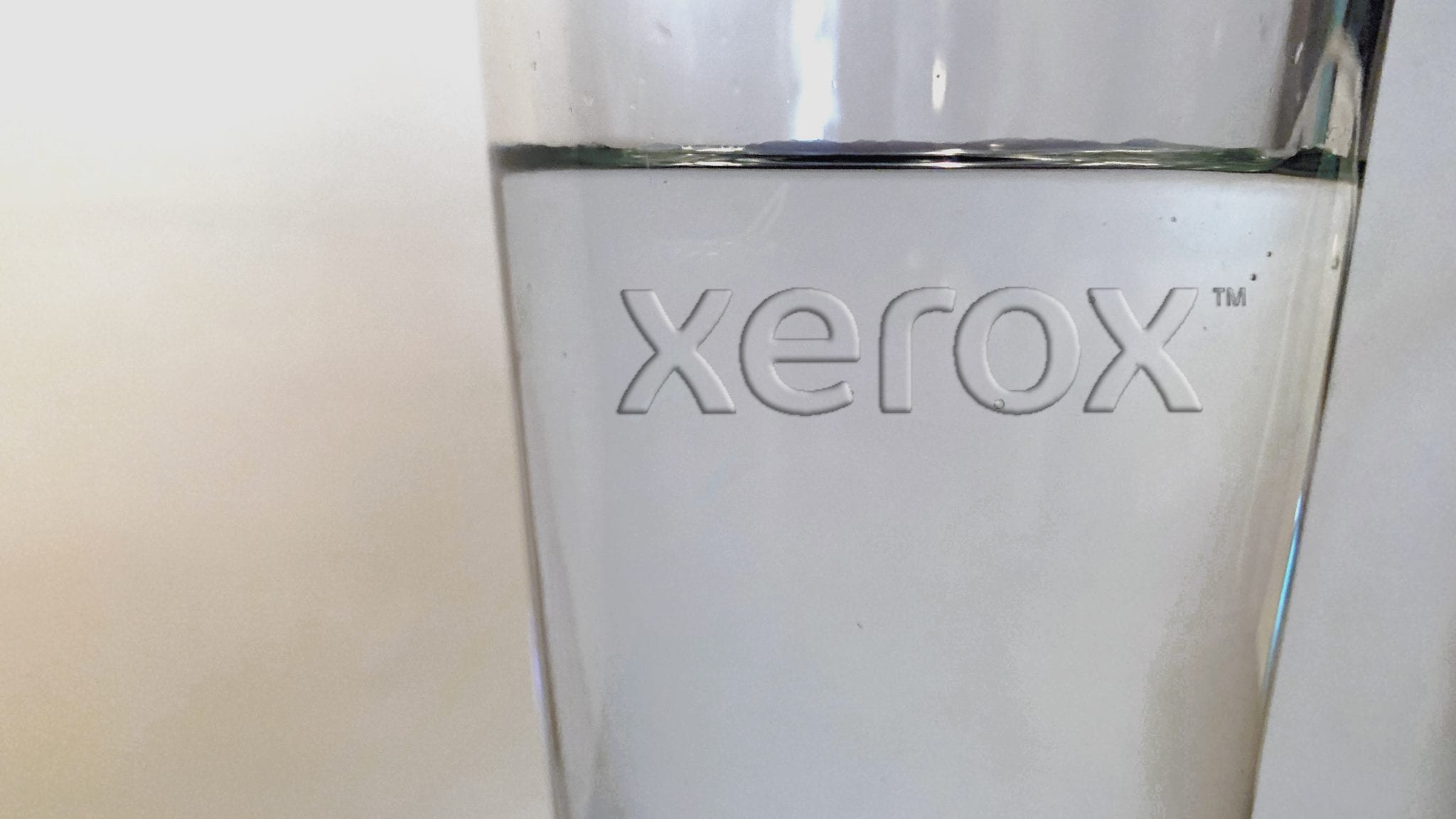
Is clear a color? That’s the question popular printing brand, Xerox, is asking us all this 2020.
The company has named clear its first-ever “Color of the Year,” – and what a thoughtful inaugural selection it is.
The transparent “color” is all about showcasing “the importance of creating a fresh look into an unobstructed future, in hopeful yet clear-eyed anticipation of what lies ahead,” according to a brand press release.

Taking it a step further, we imagine the “shade” was also chosen because represents our cultural shift towards transparency in the new decade ahead.
“For centuries, artists from Leonardo Da Vinci to Elisabeth Louise Vigée Le Brun have used layers of clear, called glaze, in their masterpieces – to add depth and texture or make them sparkle in the light,” Xerox explained. “Even for those who aren’t fine artists, clear changes how we see the world. For example, house paints are typically available in different levels of gloss or semi-gloss allowing for a similarly shiny, reflective effect, and high-gloss paint washes easier than a Rembrandt.”
Of course, any artist or interior designer who has worked with clear glosses know a shining coat can change the entire effect.

“It can enhance a color, it can brighten a color, it can sometimes add saturation to a color,” said Beatriz Custode, Color Customization & Engineering Services at Xerox.
To hear more from experts about the art and science importance of clear, be sure to check out Xerox’s captivating video below.
Curious which other brands will get in on the Color of the Year trend? Stay tuned to House Tipster Industry as we update you about all the industry-influential shade unveilings.
