The New Year 219 is officially upon us, and it is the perfect time for refreshing your space with a crisp coat of paint.
It’s also a moment where we reflect on where the year will be taking us – and Color of the Year trend forecasting does the same for the world of interior design.
If you have been following House Tipster Industry’s extensive coverage of brands’ Color of the Year 2019 picks, you will realize that there are many individual hues in the spotlight this season. Pantone selected Living Coral as its 2019 pick, while Benjamin Moore chose a neutral gray called Metropolitan and Valspar unveiled a palette full of 12 unique trend-setting shades.
But within the trending color of the year idea are micro-trends and common themes that tie seemingly unrelated shades to a bigger picture. To break it all down for us, we spoke exclusively with color trend expert Patti Carpenter of Trendscope, who was happy to share her wisdom.
First of all, Carpenter broke down one of the biggest misconceptions about the Color of the Year choices: it’s not true that brands all work together to pick one specific hue, or try to compete and go opposite of one another!
“Each of these companies comes to their color through their own criteria and research and come to their own conclusions,” she explained. “They don’t talk to each other, it’s interesting they tie back to nature this year.”
It certainly is fascinating that there’s still a unified trend in the 2019 color trend forecasting, even when there are so many wildly different shades at play. This year, more than ever, many brands are projecting nature-inspired colors, and reflecting consumers’ environmental consciousness.

“We’re focused on nature, and the nurturing elements of nature,” Carpenter shared. “That’s how humans resonate. That’s how we connect. We’re tied inextricably to that.”
So, what are some of the most standout shades of the year?
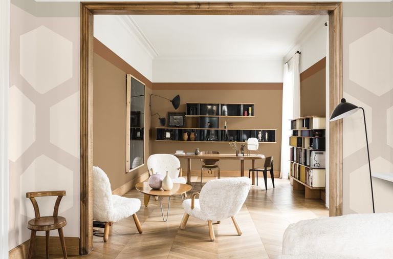
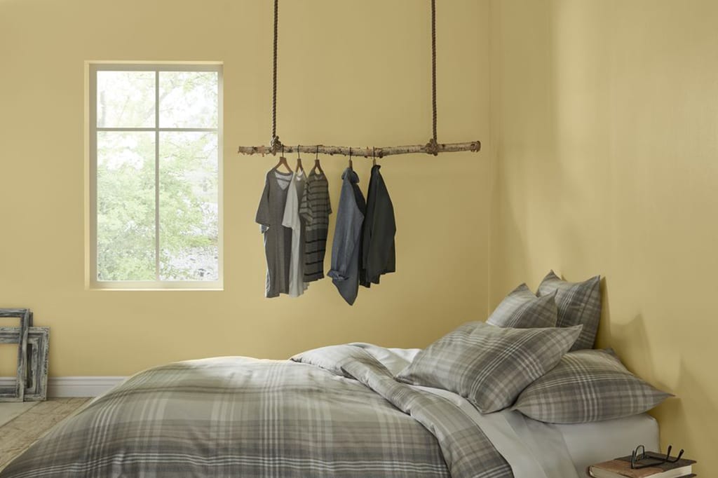
“Sherwin Williams’ Cavern Clay is one of my favorites,” Carpenter said. “[The color] ties back to what we’ve been talking about for the past 3 years, which is a warming trend, and needing comfort, warmth and something familiar.”
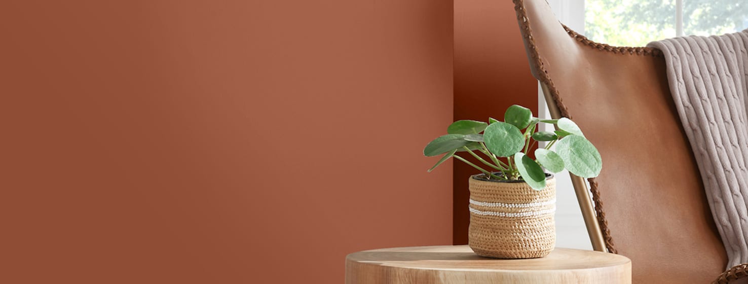
“It’s reaching back to our most basic origins,” she added. “We’ve been sculpting things out of clay since the beginning of time. It’s the most basic of materials. As we talk about climate change, seeing lava spewing out of the earth, and the rays of the sun without the protection of the ozone, we see things getting more burnt and reddened, which is why we see a trend towards reddening. You can see it in traditional mud cloth from Africa, clay on the walls in Cairo, in ancient Chinese and Japanese works. It’s a historically rooted color, we need that grounding at this time.”

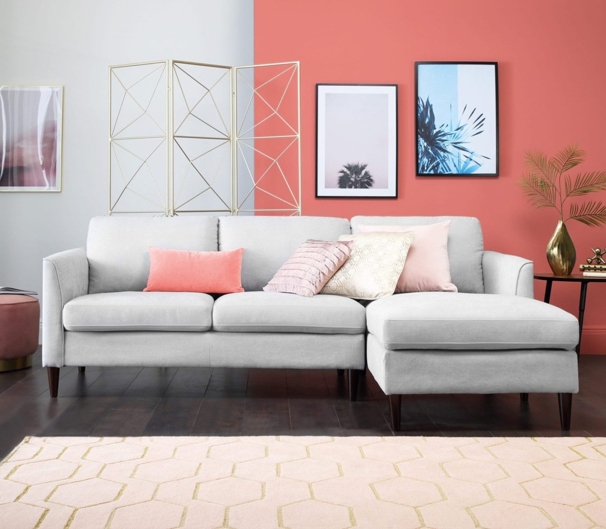
Because of its global power, Carpenter also sees Pantone’s pick, Living Coral, as having a big influence in 2019.
“Living Coral is interesting, because we’re talking about the natural living creature, not only the color coral,” she explained. “We’re killing it off. It’s not as bright. There is so much plastic in the ocean, and it’s killing the wildlife.”
To Carpenter, the color Living Coral color also embodies the hopefulness that many of us are searching for as we enter a new year.
“All it takes is some mindfulness. When we focus on colors in nature, we have to think of our role and how do we step up and preserve all of this that’s nurturing us.”
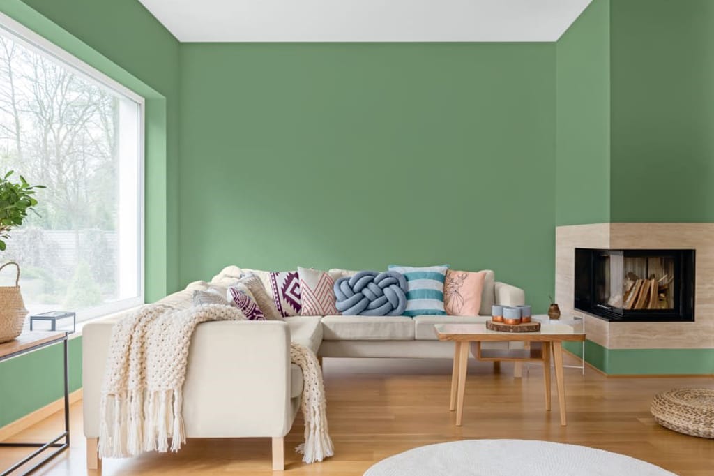
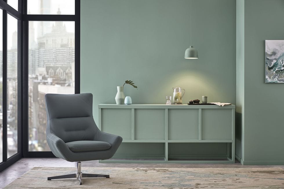
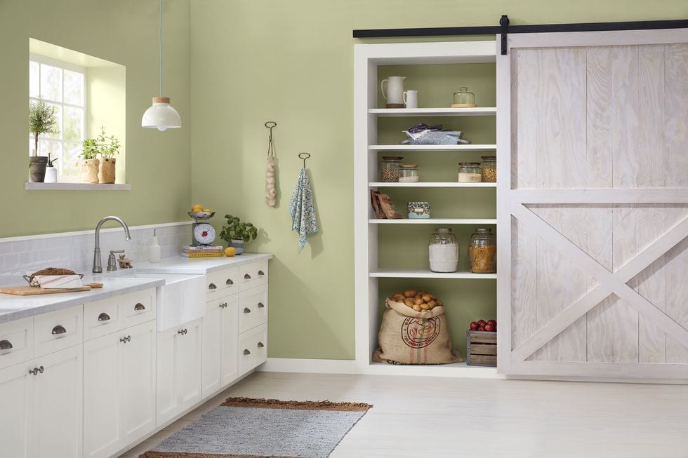
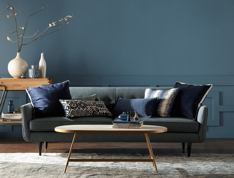
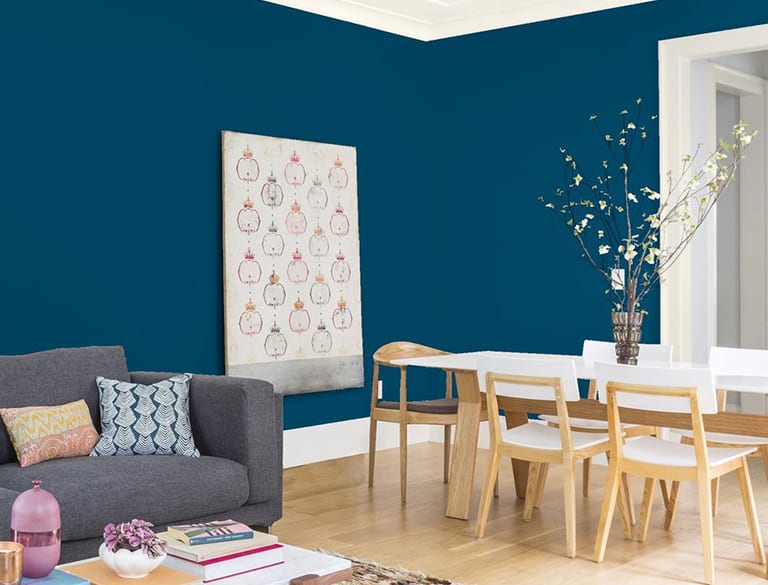
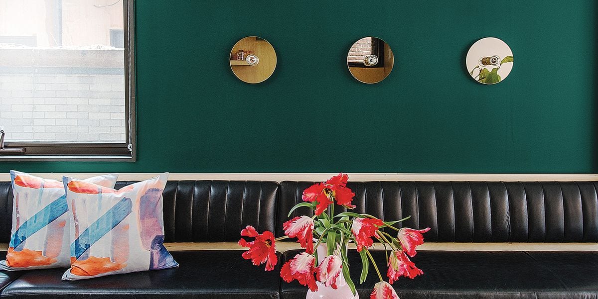
Carpenter also likes the blues and greens spotlighted by brands like Valspar, Dutch Boy, and Behr. Overall, she sees the popular colors as being incredibly influential across design spaces this year – not just in paint colors.
“Minty greens are very important in products right now,” she said. “Optimistic colors, like a new fresh sprout in the spring, [with all the] anxiousness and derision going on, give a sense of hope that is necessary.”
“You need a certain aesthetic to paint the whole room a [blue or green] color, but they are great accent colors, on the wall, in printed patterns, as pillows and throws, and against taupes and grays. It’s useable and ties back to nature,” she added.
Even if you are not planning to use a Color of the Year paint shade in your 2019 designs, it’s a wonderful thought to tie back the décor to a little piece of nature!