PPG Paints recently announced its 2020 Color of the Year choice: a deep, high-intensity blue called Chinese Porcelain.
The shade is strong and striking, yet also represents an intentional cultural shift back to the calmness of nature. House Tipster Industry spoke exclusively with Dee Schlotter, the senior color marketing manager for PPG paint brand, to hear about not only how influential the shade is expected to be in the coming year, but how it was chosen to represent the start of a new decade ahead. You can find our comprehensive Q&A interview below.
House Tipster Industry: Can you share a bit about your Color of the Year selection process, and how Chinese Porcelain rose to the top this year?
Dee Schlotter: Unprecedented challenges are being faced around the world, creating a new wave of anxiety in consumers. Recent studies have found that millennials, especially women, are the most anxious generation in history. These mental health challenges have led consumers to crave real-life connection, reassurance, purpose-driven mindfulness and happiness. Consumers are seeking a greater balance through living more fully in the present, practicing gratitude and spending time with family and friends.
The increasing need for connection in an unmoored world was a reoccurring theme at the recent PPG Global Color Workshop. This annual event brings together more than 20 PPG global color stylists from the automotive, consumer electronics, aerospace and home paint and stain industries. Over the course of several days, the stylists analyze the runway, lifestyles, demographics, geographies, and global and cross-cultural societal inspirations to determine what colors will resonate and represent the PPG global color forecast, including the PPG Color of the Year.

PPG Chinese Porcelain is a deep, shaded, orchid blue that instills calmness, reduces anxiety and encourages sleep. This soothing blue imparts slowness, encouraging consumers to practice mindfulness and be more present in their lives while also offering the spirit of hopefulness – a precious commodity in a restless world.
House Tipster Industry: Was there any extra consideration with the 2020 Color of the Year, as it is also setting the tone for a new decade ahead?
Dee Schlotter: Through the past several decades, we’ve seen major cultural and historical events impact color trends at the time. For example, cocooning colors like soft pinks and chocolate browns rose in popularity after 9/11, and classic, adaptable white paint color trends represented the spend-conscious consumer following the 2008 financial crisis.
While these milestone moments in time affect color preferences, we also try to identify the underlying, longer-term trends, like how nature-inspired colors have played a major role in our color forecasts the past three years in a row.
In the next decade, as technology moves even faster and offers even more convenience, consumers will seek activities, experiences and lifestyles that impart slowness and realness into our lives. Blues reflect the simplicity and escapism from technology that we will likely continue to crave.
House Tipster Industry: Where are some places your team saw this color popping up most during research – through travel, in markets, and beyond?
Dee Schlotter: According to recent data released by Paintzen, a PPG-owned technology platform that allows customers to pick colors and schedule painting services, blue is the most explored color family by its users, with 34 percent higher engagement than neutrals – the next most popular color family on the site. Of the blue hues, Chinese Porcelain was the most engaged color on the platform over the past six months.
All our business units across the globe and country agreed on the color family blue as the biggest trend for next year. Sleep is the new superfood—sleep can do much more for your body than the latest superfood. Mattress companies and sleep products are exploding in popularity. Blues are the color for sleeping so this fits the society’s sudden obsession with sleep and the good it does for us. It’s hard to go wrong with this versatile hue.
PPG’s Chinese Porcelain delivers the energy of cobalt and Klein blue – two trending, high-intensity hues taking the automotive, consumer electronics and fashion industries by storm – while also incorporating the sophistication of a deep, muted navy, popular in both residential and hospitality design.
House Tipster Industry: We’re seeing a huge shift towards nature with design and color choices. Would you be able to shed some light on why you see this happening?
Dee Schlotter: The nature story is continuing in 2020 because we do not spend enough time in nature. The urge to connect with the restorative power of nature is important in society now more than ever. Blue is in the sea and sky, so it helps ground us to nature. It is a very trusting color and is hopeful and optimistic. When we look to the horizon where the sky and sea meet, we feel hopeful. Blue gives us the feeling of trust and trustworthiness which is so needed right now.
House Tipster Industry: This blue is bold, but it seems like a universally-loved shade. What about this color do you think speaks to so many different people?
Dee Schlotter: People are getting tired of the neutrals. People want a little more color and personality on their walls. Blue is the most popular hue after neutrals. Most people like some version of blue. In fact, I don’t know anyone that doesn’t like some variation of blue. Blue is a very common color family and everyone likes a different shade of blue. Blue is safe, loyal, trusting and is the best possible entry point from the world of neutrals,
making it the perfect color for homeowners that are afraid of introducing color into their home.
House Tipster Industry: Where are some of the best applications you see this color having within an interior design space?
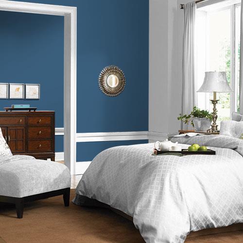
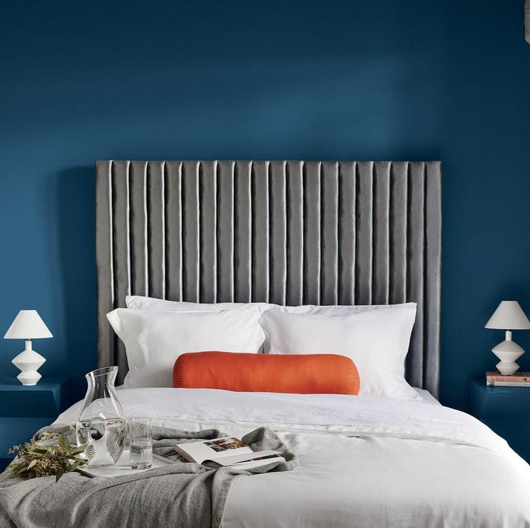
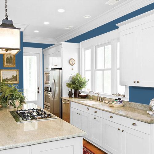
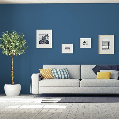
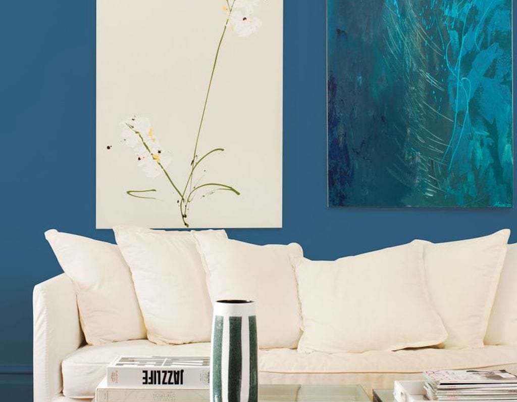
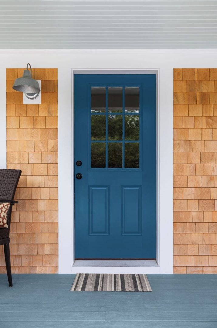
Dee Schlotter: Chinese Porcelain is a rich and traditional hue that provides the perfect, agreeable backdrop for vivacious colors to pop. It also can act as a feature color in a bedroom, enveloping the space and pairing well with crisp white bedding and crown molding to provide a sharp contrast. In the living room space, the hue can be layered with additional blues in tufted and velvet furniture or paired with trending metallic finishes like Hushed Copper (MTL141) from the PPG Metallic Tones collection. Chinese Porcelain also really pops on a front door, especially in New England and in other beach and coastal areas.
We are seeing a lot of people using interior doors as an accent wall. Chinese Porcelain looks gorgeous on an interior or exterior door and is a perfect way for homeowners to introduce more color into their home.
House Tipster Industry: How do you think Chinese Porcelain continues the story of 2019’s Color of the Year, Night Watch?
Dee Schlotter: Blue is an easy move from the once trending neutrals. This color is big for cabinets, we are seeing a lot of the cobalt blues and navies used on cabinetry. The nice thing about our 2020 COTY is it has a mix of cobalt blue and navy.