Pantone Color Institute teamed up with Visit Carlsbad and marketing platform Fohr to reveal 2019’s trending “Colors of Travel” palette.
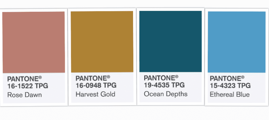
The agencies compared popular global travel photos across 75 online photo-sharing platforms run by influencers with over 50,000 followers to arrive at a selection of four colors that are standing out right now. For 2019, those shades are 16-1522 Rose Dawn, 16-0948 Harvest Gold, 19-4535 Ocean Depths, and 15-4323 Ethereal Blue.
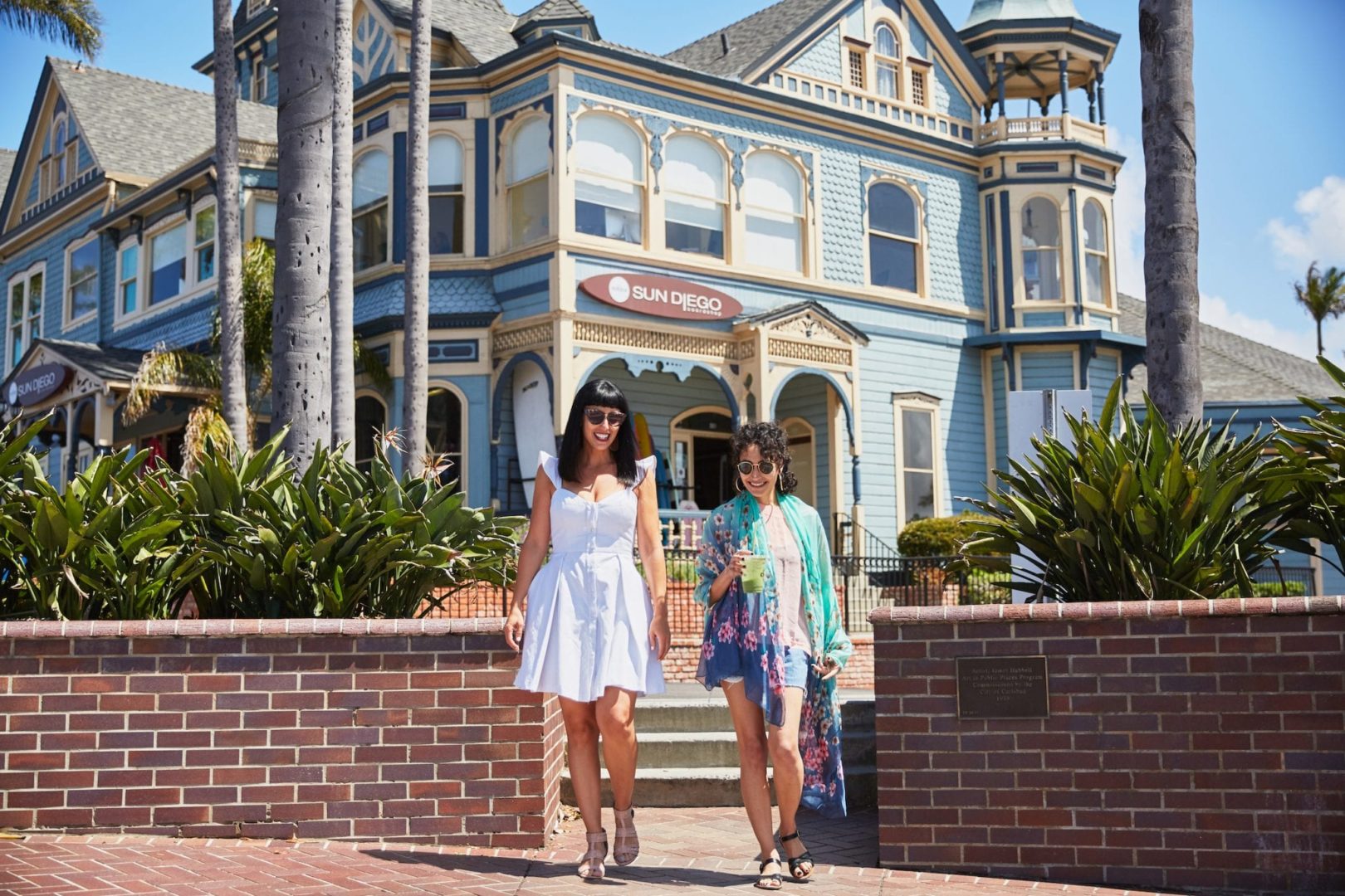
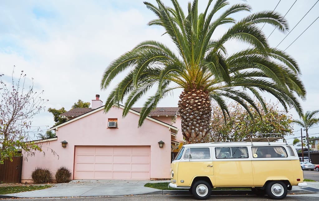
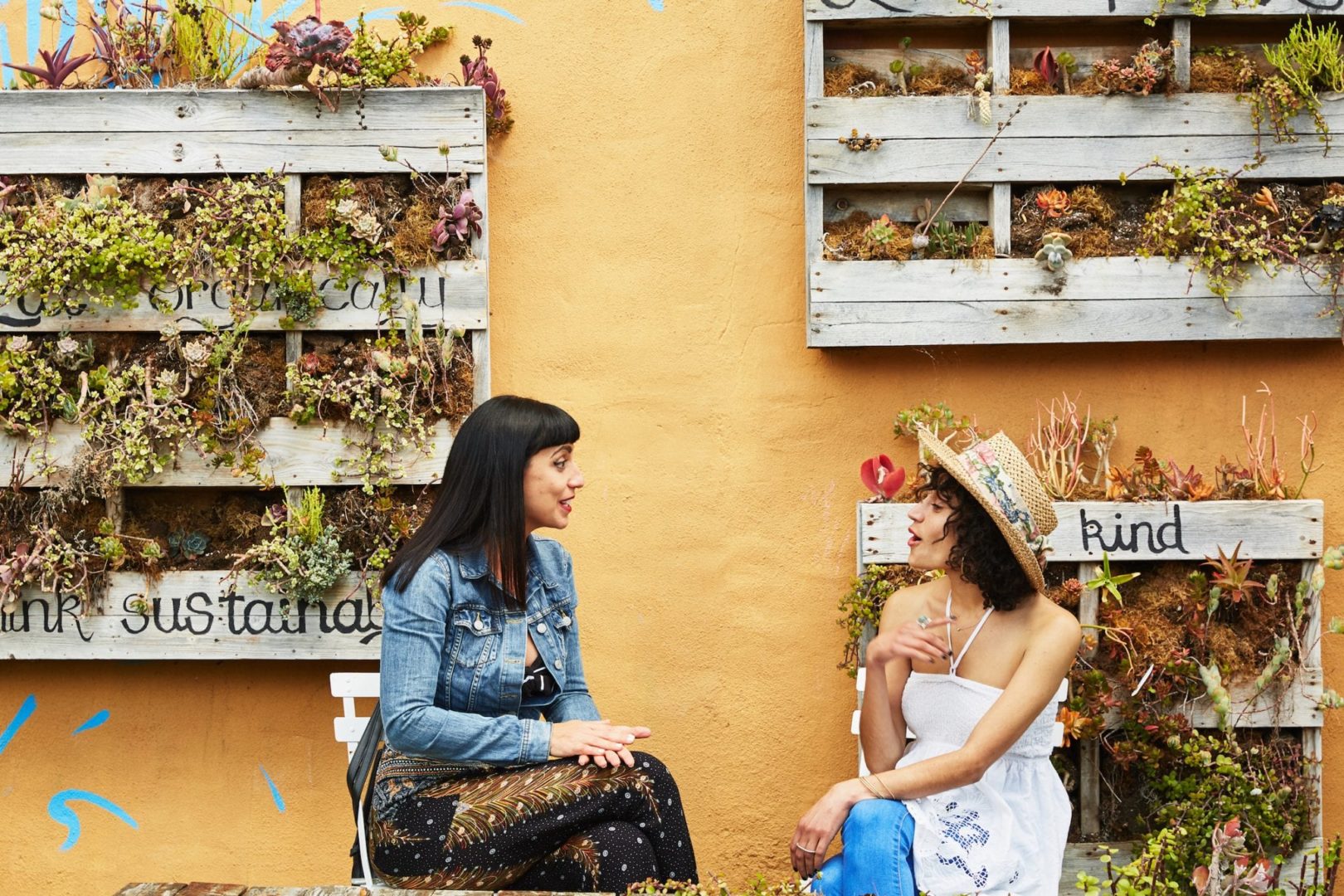
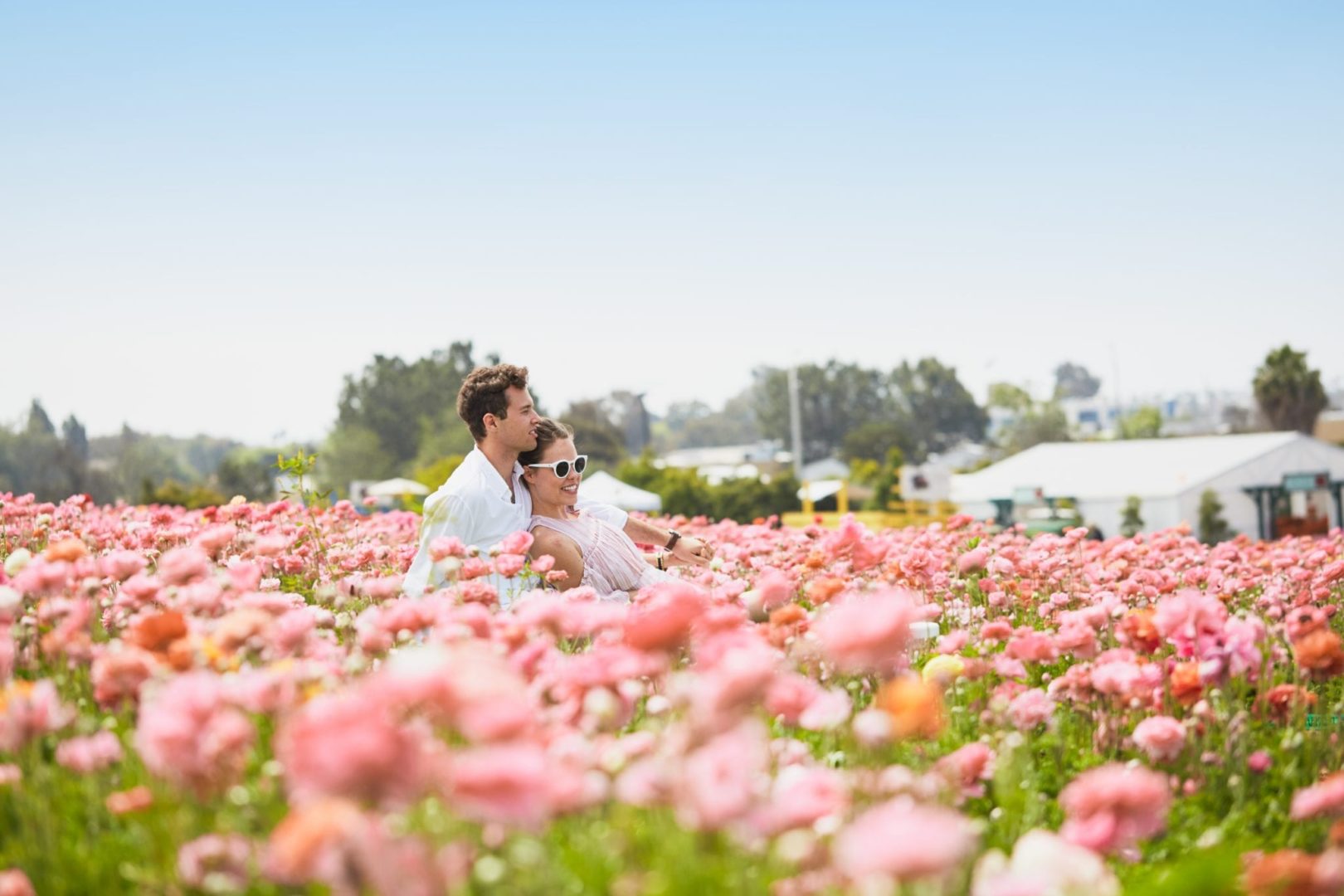
All of these shades can be found throughout the beach town of Carlsbad, California’s “Village by the Sea.” From the warm and fiery sunrises to the crisp, cool ocean waters, this organic color palette works perfectly together in nature and design. You can also spot these shades in Carlsbad’s seaside storefronts, hotels, and residences.
Pantone explained that there’s a great variety of influences and applications stemming from this color selection.
“From the open and expansive blue sky that conjures up endless opportunities for outdoor recreation and the soothing deep teal lagoon waters, to the savory and spicy golden yellow suggestive of exotic culinary surprises, and warming rose tone of the wondrous sunrise, this year’s colors highlighted in the 2019 Colors of Travel Study brings to life the unique beauty of Carlsbad’s natural surroundings and wellness oriented lifestyle,” said Laurie Pressman, Vice President of the Pantone Color Institute, in a press statement. “Calming and comforting, yet at the same time, inspiring our imagination and containing a touch of the exotic, a palette of color that expresses our desire to engage, connect, and experience; not only with nature and with others, but also with ourselves.”
Pantone and Fohr’s research shows that social media’s emphasis on color has added a new dimension to global travel.
“Color has always been a part of why we travel,” Grace Murray, the vice president of Fohr, said in a statement. “The desire to ‘see’ a new place is rooted in a mental image we’ve already conjured: we are drawn to land and cityscapes that look drastically different to our own. Instagram’s influence over people’s travel decisions is incredibly dominant.”
“Using a quantitative analysis approach, we discovered that the current trending, appealing, and engaging hues in inspiration travel photos are much more grounded, calming and muted compared to the vibrant hues from a similar study last year,” Murray said.
To stay up-to-date with all the latest trending color news and more, be sure to follow along with House Tipster Industry.