In the world of interior design, a paint company’s choice for their Color of the Year is a defining moment.
That color will determine the mood and tone for the coming year and create a ripple effect seen in not only wall colors, but also in interior design essentials such as area rugs, furniture, pillows, curtains, tablecloths, millwork, kitchen cabinets and other room defining essentials.

Last year, the Benjamin Moore company unleashed Caliente, a fiery red color that was meant to be bold and full of adventure. This year, the paint company is turning down the energy level with a more subdued color for its 2019 Color of the Year – Metropolitan AF-690.
Andrea Magno, a color and design expert for Benjamin Moore, said it’s a fitting selection for 2019 ahead.
“It was a perfect choice because it captured the excitement and high energy of the time,“ Magno said. “It is a welcoming and comforting sophisticated gray.”
“We just absolutely love it because it works so well in any style home and you can use it in any room, and it really captures the atmosphere that we were picking up on,” she added.
Interior designers and other professionals in the home and building trades have long known about the power of color and its ability to convey messages and mood. An individual’s reaction to color is often very personal and comes from their own personal experiences. Certain colors have the ability to soothe and heal, where others motivate and empower.
“For 2019, we sense this need for comfort and calm and kind of an escape from the noise,” Magno said. “Using Metropolitan, it captured that sensibility and that retreat into the home.”
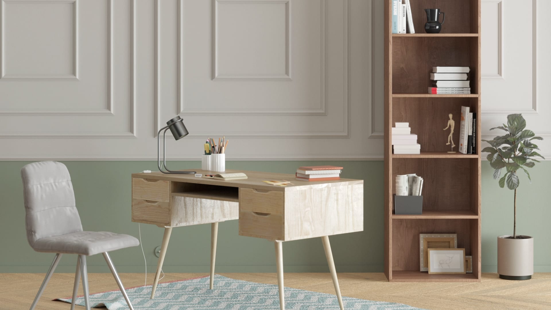
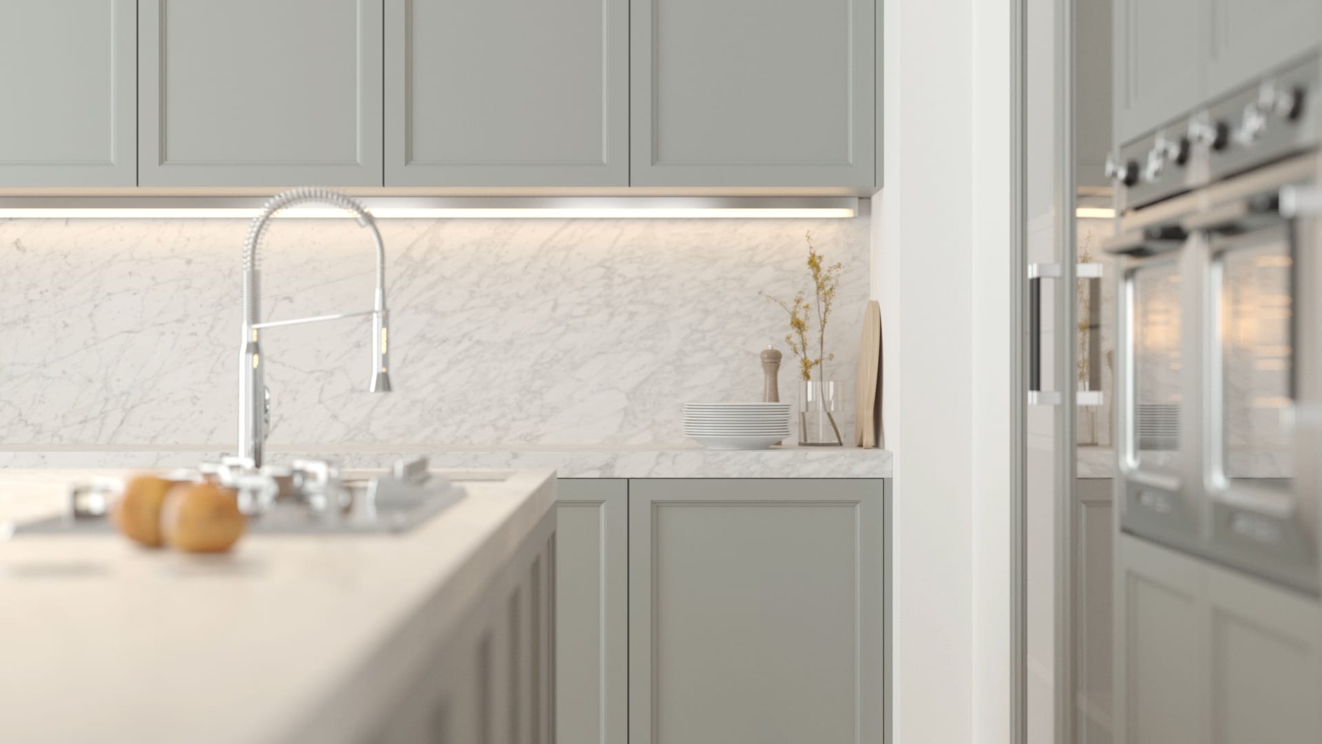
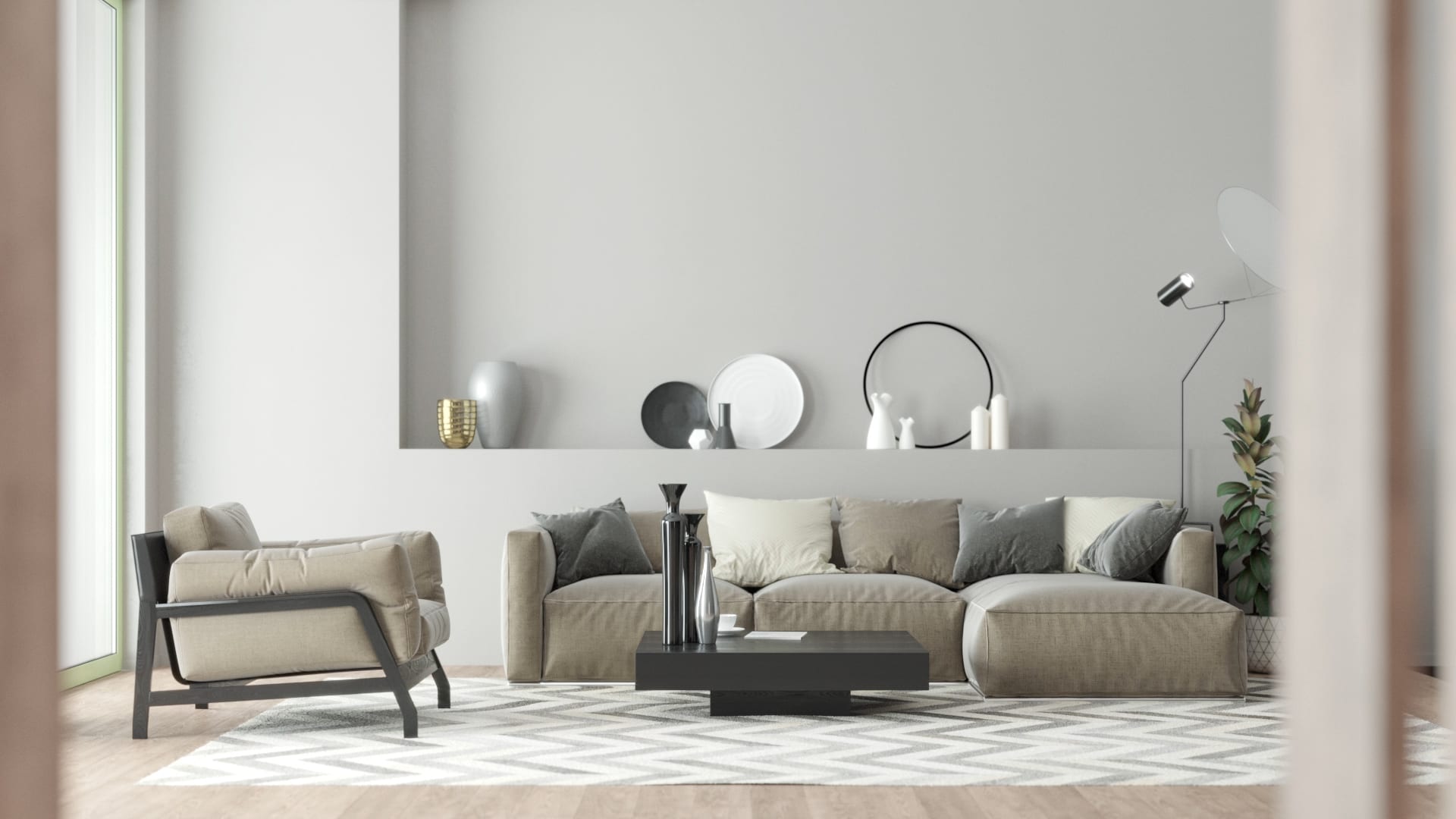
Last year’s Color of the Year, Caliente AF-290, wasn’t exactly a color that could be used throughout the home. It was more for a feature wall or to add color to a front door. Metropolitan AF-690 is a much more practical color that can be used in any room. It can help balance a high energy space such as a kitchen or bathroom, and add a sense of serenity and order to a bedroom or living room. It can also be paired with darker colors or other neutral colors.
“What we’re seeing with a color like Metropolitan is that it’s really sophisticated in its nuance and it really adapts to where you’re using the color,” said Magno. “It’s almost gray reinventing itself.”
With so many colors to choose from (more than 3,500), how does Benjamin Moore narrow it down to just one? Magno explained it’s a process that spans the entire world.
“We go globally, we’re in our backyards, we search near and far for what the Color of the Year is going to be and even the palette that accompanies the Color of the Year,” she said. “We want to be the eyes and ears for homeowners and designers and report back on all these great things that we’re finding.”
After all the research is analyzed, the deciding factor is how the color will work in the home.
“A lot of times there may be colors that may be really trendy, and it may be a really awesome color, but maybe it’s not the best color for use on the walls,” Magno said.
The Benjamin Moore Color & Design Team has found that people are leaning towards soothing neutral colors with subtle ties to nature.
The defining factor for Metropolitan came from a trip taken by a Benjamin Moore team member. While visiting a friend in England, she noticed how gray was the primary color in the stone of the buildings, the clouds in the sky, the mist in the air. The gray gave everything a very relaxed and soothing feeling.
“What she was seeing was this really neutral palette but there was still color to it, rich greens and beautiful grays. That was a moment for her where it all sort of came together,” said Magno.
The rest of the Benjamin Moore Color & Design Team was quick to agree that gray was the color needed to give homeowners a sense of comfort and an escape from the noise and stress of everyday life, yet maintain a look of sophistication and elegance. Metropolitan AF-690, a silvery gray that adapts to its surroundings, was that color.
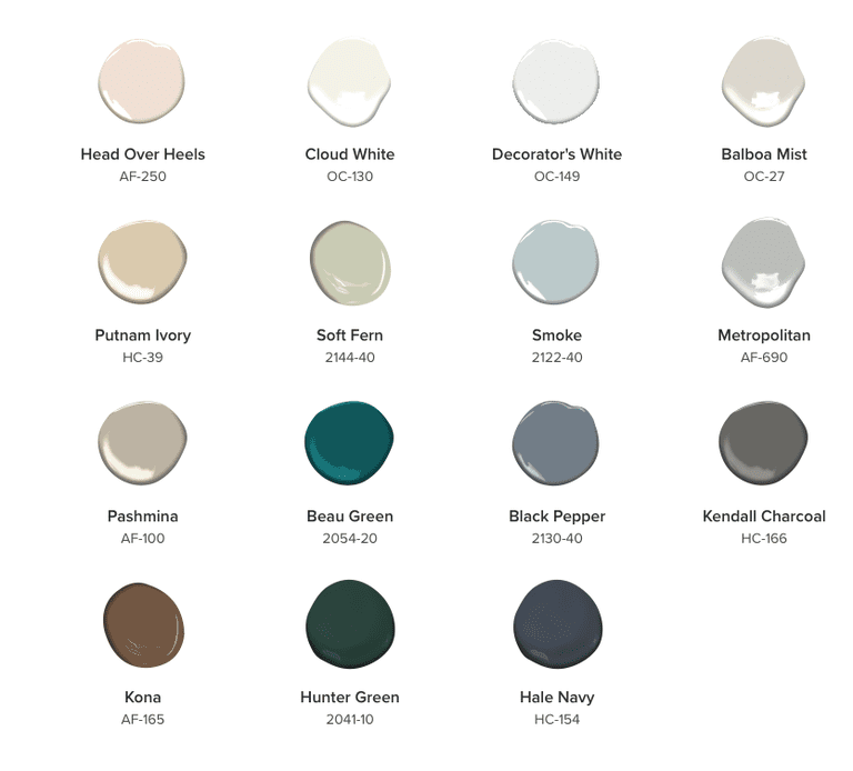
In addition to a Color of the Year, Benjamin Moore also released a new palette of colors meant to complement Metropolitan.
“For 2019 we have 15 colors in our palette including Metropolitan, and I am really excited about the palette because I have so many favorites in there,” said Magno. “You can use that entire palette for a whole home.”
Just as much thought and research goes into the 2019 color palette as does Color of the Year. The Color Trends 2019 palette features hues ranging from neutrals to rich greens and dark blues. Many of these colors were inspired from the London countryside trip as well.
Wondering if Metropolitan AF-690 is right for you? Magno suggests sampling the color by placing the sample color swatch next to objects in your home. Trying it on the wall will only tell you how it looks in comparison to the existing paint color and keep you from seeing the new color’s undertones.
This is especially true of neutral colors like Metropolitan. It can appear a very neutral gray or have a blue or green tinge depending on lighting and surrounding colors.
“A color-confident homeowner probably wants to repaint every two years,” Magno said, “but then you have other people who are going to paint every five to seven years, or you have people who will paint every 15 years, so it really depends on how frequently you want to go through that process.”
Metropolitan is a color that will pair well with other neutral colors or compliment bolder, darker colors. It also makes a great backdrop as a standalone color in a living room or bedroom.
Magno sees Metropolitan as a color that will appeal to people who do not want to take on a major painting project every couple of years.
“We don’t want it to be in and out in a year,” she said. “We want it to be something that you can paint your home with and you’re still going to love it five years later.”
Stone walls, misty meadows, meandering garden paths. For a year that has experienced more than its fair share of chaos and unpredictability, Metropolitan is a color that speaks of quiet and comforting spaces.
Ready to cover up some chaos? With 15 new harmonious hues, you’ll be sure to find a color or two that speaks softly to you.
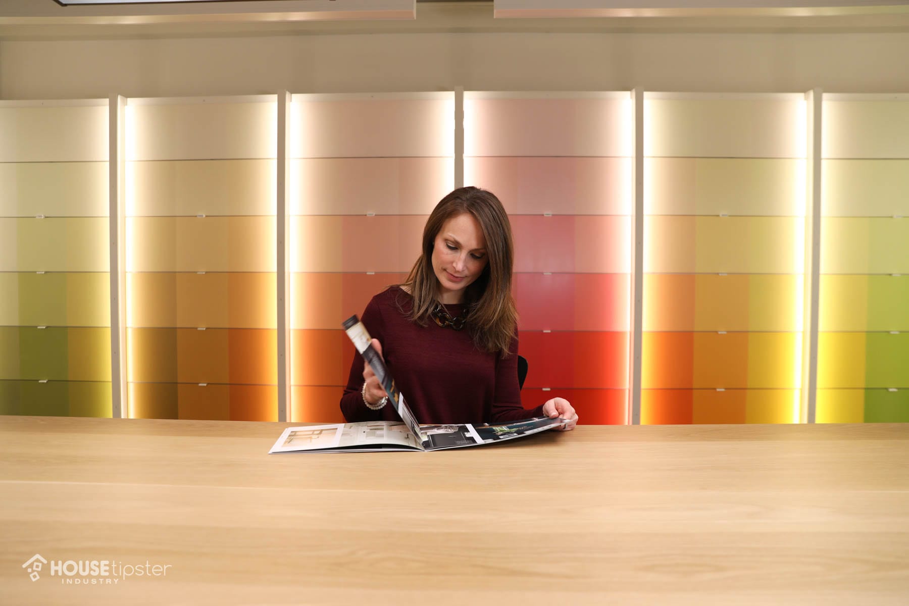
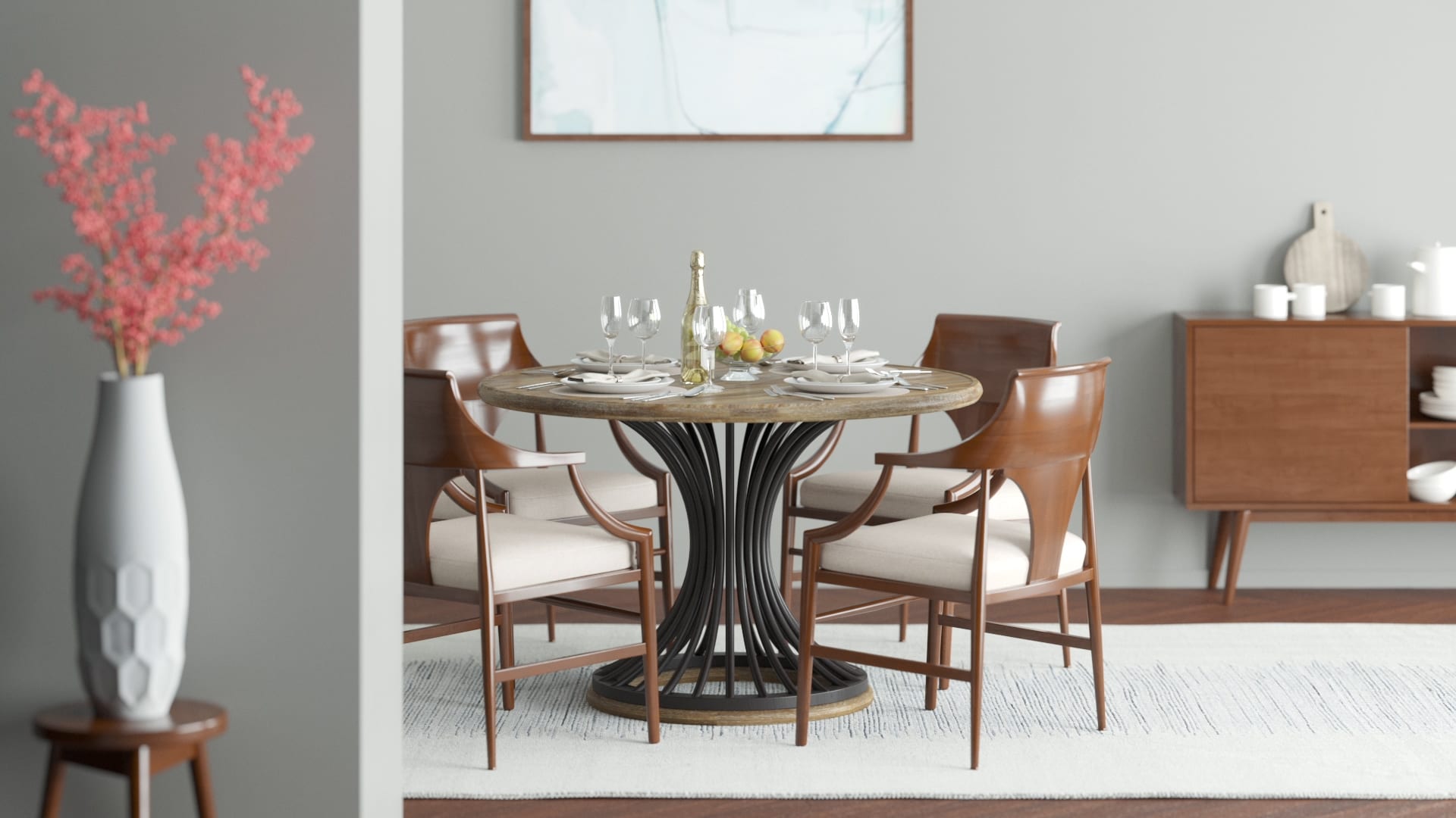
To help you visualize how Benjamin Moore’s Color of the Year 2019 palette will work together in your space, the House Tipster 3D team has created virtual animations to showcase the colors in action.
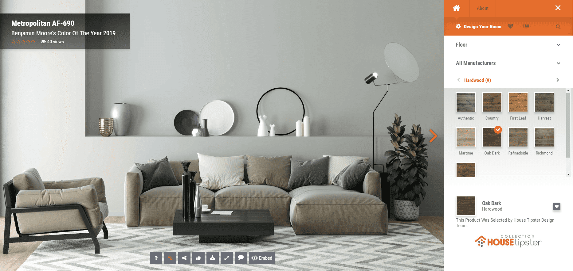
You can find these color renders and more in our exclusive video below, which also further details our exclusive interview with Andrea Magno.