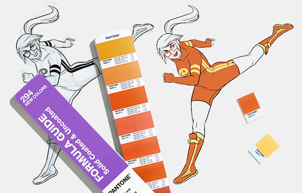
Color authority Pantone has updated its comprehensive color collection to include vibrant new hues for special use particularly in graphics, packaging, print, and product design.
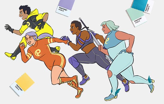
To release these new colors, Pantone worked with animator and illustrator Carly Monardo, who created an engaging four-palette color story to correspond with imaginative, graphic “characters.”

Kinetta, Stellknight, Zephire, and Bash are dynamic superheroes that bring each color set to life. These sets center around common top picks like Pantone 1205 C, 4162 C, 439 C, and more.

“All of the characters are built around their main, thematic color — but because they are a team, they influence and grow on each other, which has lent itself to some intermingling and shared colors,” Monardo shared with Pantone. “The yellow of their team logo represents the energy and universality of the sun; these four different people are drawn to each other the same way the planets orbit the sun.”

“For designers working with multiple materials across Pantone Systems, our 294 new colors were specifically created to provide better matches to the Pantone Fashion, Home + Interiors (FHI) Color System,” the brand announced on its website. “With the addition of more fundamental colors (neutrals, tans, grays, navys, blacks) within a library of 2,161 colors, designers can now confidently achieve more trend-relevant colors throughout their design process.”

“Color is huge! You can’t underestimate the impact color has on your audience,” Mondardo added, via Pantone. “People are drawn to color in a way they aren’t to black and white line-art; we’re trained to think of color art as ‘finished.’”

Laurie Pressman, VP, Pantone Color Institute explained that there are so many ways these new hues can be incorporated into design work.
“From the selection process to the context in which the color or color story appear, the material or surface to which the color is applied, and even more importantly our hopes and expectations of how people will react to those choices, there are so just many things to consider!” Pressman said, via Pantone.

These colors and more are now available in Pantone’s formula guide, color bridge, solid chips, and graphics bundles.
