Pantone is known as the top color trend authority in the design industry, whether it’s in the realms of fashion, graphic design, interiors, and beyond. The institute has just announced its Color of the Year 2020 pick, Classic Blue, and the deep shade is already on its way to standing out in the new decade ahead.
It’s called “classic” for a reason: the blue making waves across the industry is a timeless and relaxing favorite.
But there’s also a very real reason why the hue is emerging as a trend at this specific moment in time: people are relating to it, and the color looks great practically everywhere you put it. So it’s no wonder top home design experts across the industry are excited about Pantone’s top pick.
Sue Wadden, director of color marketing at Sherwin-Williams, noticed close similarities to the paint brand’s own 2020 color trend pick, Naval, which was announced in September.
“We’re on the same page as Pantone for 2020,” Wadden shared in a press note. “Deep blues like their Classic Blue and our own 2020 Color of the Year, Naval SW 6244, are poised to carry us into the next decade. Relaxing, assuring shades of navy add a calm confidence to any space of the home, from living rooms to bedrooms and kitchens.”
Of course, rich colors aren’t limited to only the paint on the walls – and there are so many exciting ways to incorporate bold blues into modern design projects in 2020 and beyond.
Jackie Schneider, CID, Vice President of Marketing at window and door brand Marvin noted that the shade inspires designers and design enthusiasts alike to get creative.
“Deep blue tones like Pantone’s Classic Blue are timeless colors that offer homeowners flexibility from a design perspective,” Schneider said in a statement.
“Homeowners are interested in flexing their creativity by cultivating spaces that are thoughtfully designed to evoke certain feelings or emotions.”
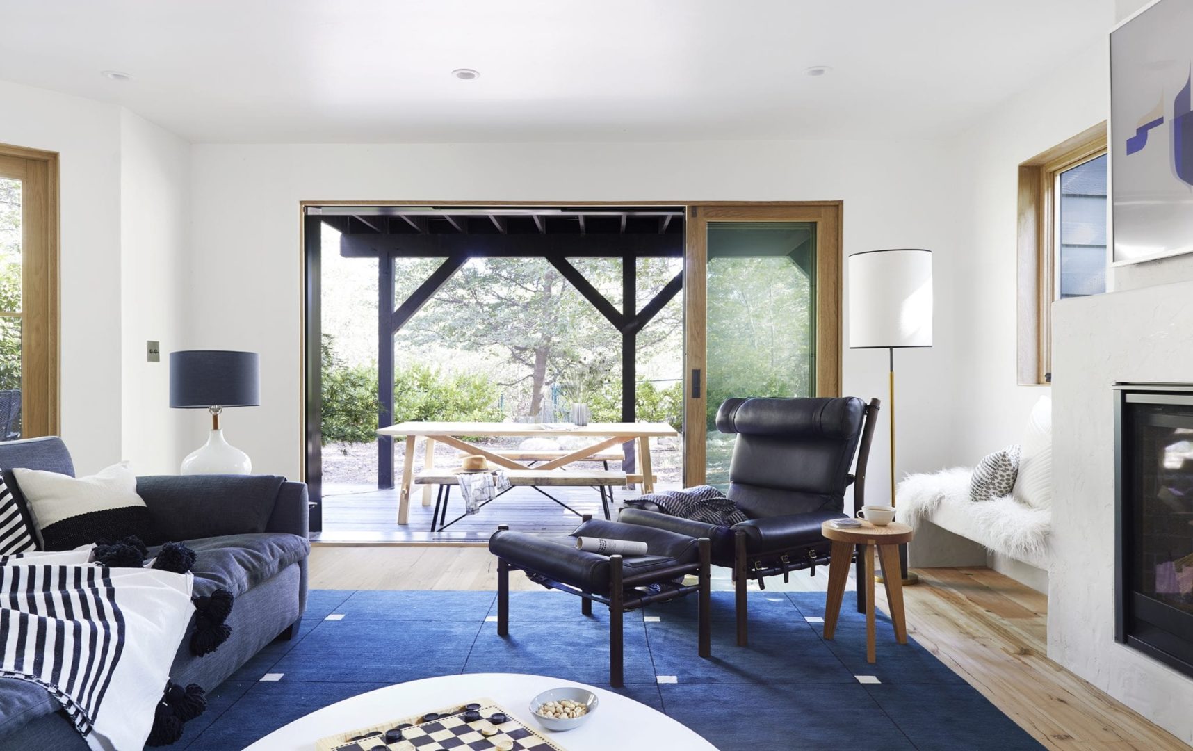
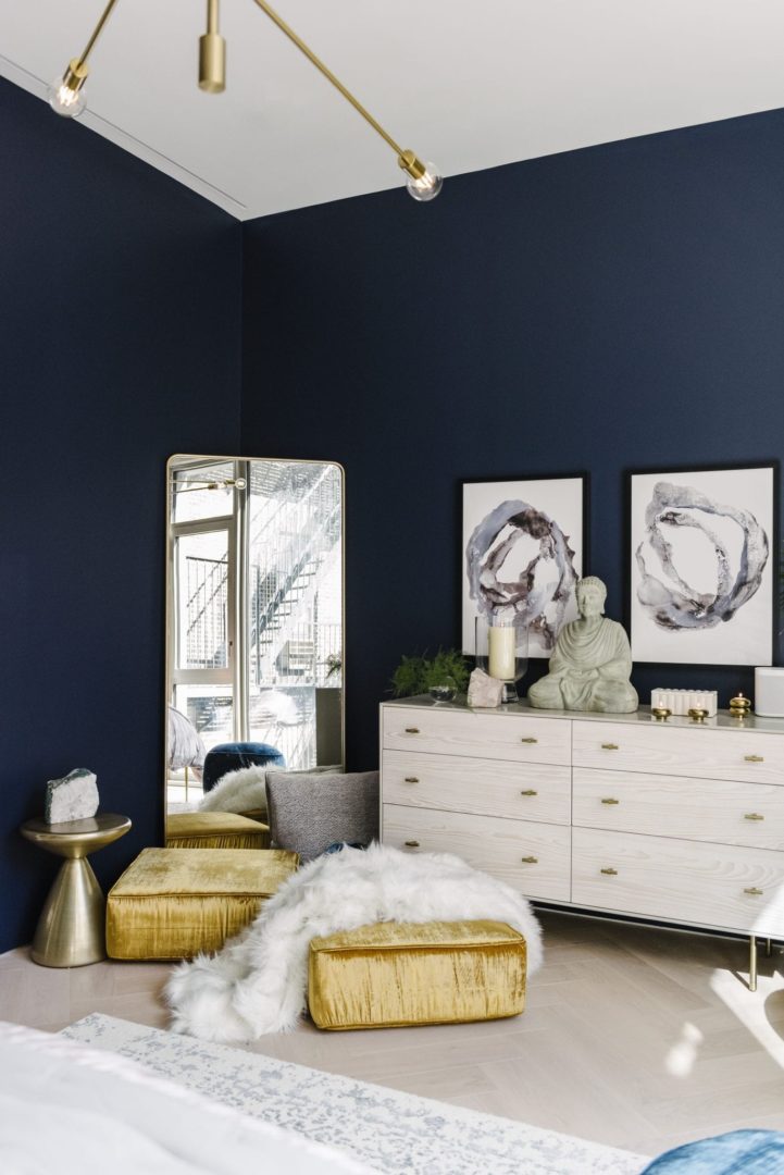
‘Deep blues can be used as both beautiful, grounding accent colors or even as a dominant color in a room for a bolder statement, like theater rooms, living rooms or smaller powder rooms,” Schneider noted.
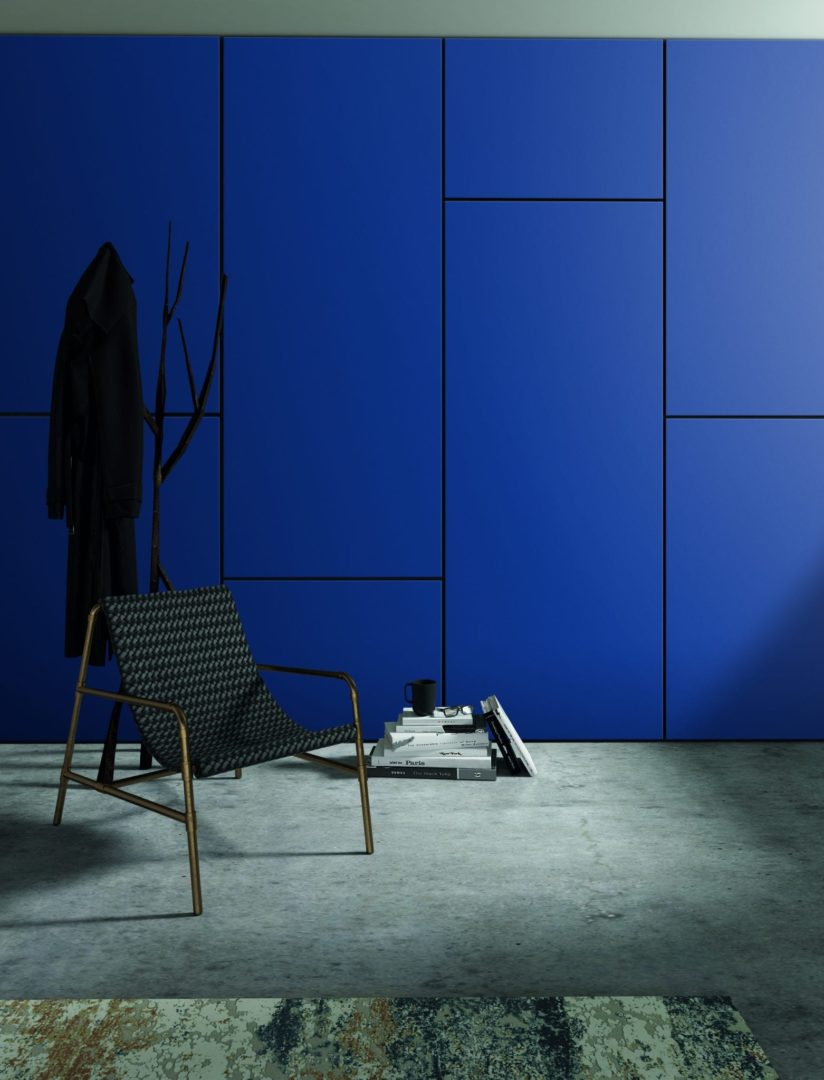
Similarly, navy blues can work wonders in accent rugs, throw pillows, wall coverings, and beyond.
Renee Hytry Derrington, Global Design Lead at Formica Corporation recommends using the standout shade as a new neutral – or the ultimate statement piece.
“As we enter a new decade, Pantone’s 2020 Color of the Year, Classic Blue, provides a calming anchor for people seeking comfort and stability in the spaces that surround us,” Hytry Derrington said.
“Classic Blue is a bold, boundless hue that works in just about every commercial and residential space as a neutral or a feature color. Formica Laminate in Marine Blue is a darker, sophisticated take on the classic blue that evokes deep feelings of relaxation.”
Stephanie Pierce, director of design and trends at MasterBrand Cabinets also noted an uptick in blue colors for wood cabinetry.
“Pantone’s 2020 Color of the Year, Classic Blue, embodies a casual sophistication that compliments a wide array of other colors, making it a harmonious tone,” Pierce said.
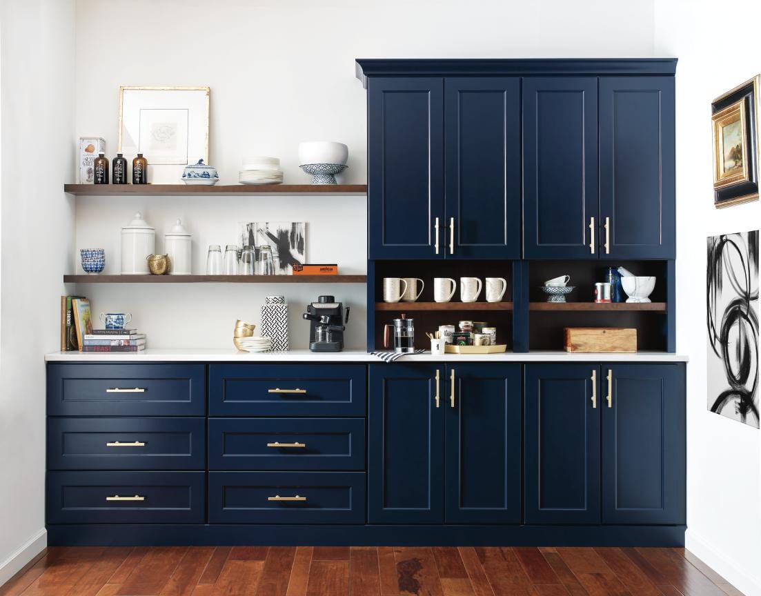
“Masterbrand Cabinets has seen blue kitchen accents making waves in our segment of the market with finishes like Maritime, Naval and Blueberry,” Pierce explained. “It’s optimistic and inviting and pairs naturally with shades of white, gray and trending wood tones. Classic Blue represents a new era that cements deep blues to be an important tool for designers and a confident choice for homeowners.”
Gallery: Get interior design inspiration featuring the Pantone Color of the Year 2020, Classic Blue.
Stay tuned for more color trend reports and reactions, coming soon to House Tipster Industry.